
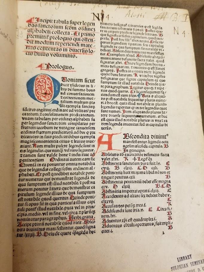
Prior to the era of the printed book, manuscripts did not have title pages. The original rationale behind printing a title on the lead page has often been explained by two key reasons tied to the printing of books. The first is that the printed book was a commercial object, and the presence of a title indicating the book’s contents would help advertise the work to consumers. The second reason has more to do with the economics of early book printing, with the printed work not being bound until much later, usually by a separate binder from the printer. As a result, there was a need to be able to easily identify what the contents of a printed stack were for the bindery and possibly protect the work while in storage and transit prior to binding.
These questions of how best to protect the work, how to identify what one has produced, and how to advertise it to consumers were “new needs brought with the advent of mass production.” Thus, when one compares the printed book to the production of pre-modern books – where binding came about right away and works were transcribed one at a time – it makes practical sense that medieval works would lack a title page.
The first several decades of the printed book – the incunabula period – witnessed much experimentation in how to label printed books. In broad strokes, the early development may be highlighted through the following developments: incipits and colophons, label-titles, and woodcuts and borders.
What came before the printed book? Prior to the late fifteenth century, manuscripts produced in Europe did not have title pages. Many works lacked any title and would usually be identified by one or two features – the incipit and the colophon. The incipit was a common feature of most manuscripts, with it being either the opening line of a text or a distinct line preceding the main text. These lines would be on the first page of the text, sometimes highly ornamented or inked in red. These incipits could be the opening line of the text, a summary of the work contained within the manuscript, or a descriptive title. (The closest modern equivalent to the incipit is the title, with the incipit offering a summary or description of the text’s contents.) During the incunabula period, many early books followed this tradition of manuscript production, using incipits as their “titles”. Publishers would even hire rubricators to add in red ink over the incipit once the text was printed, mimicking medieval manuscript incipits.
The colophon, which was less common than the incipit, was a feature added at the end of a text. While not having its own separate page – usually being included at the bottom of the last page of text – it offered information about the author, context of production, and date. Colophons may describe who transcribed the text, for what purpose or for what audience, and the location and date of production. It may have all or only some of that information. The closest modern equivalent information would be publisher and author details, now located on the title page. In the incunabula era, colophons continued to exist providing the author and production details.
Among the first developments of the incunabula period was the label-title. This piece was often a short description on the first page of the printed book. Despite sometimes being marked in red by rubricators after printing, the label-title was distinct from the incipit in that it was separate from the text. The label-title was placed on its own separate page removed from the main textual body, and its content was often abbreviated with a simplistic layout. The short title given to the work would be set in a simple layout, usually a few lines of text or a descending triangular pattern of words. The label-title arguably marks the first appearance of a distinctly recognizable title page.
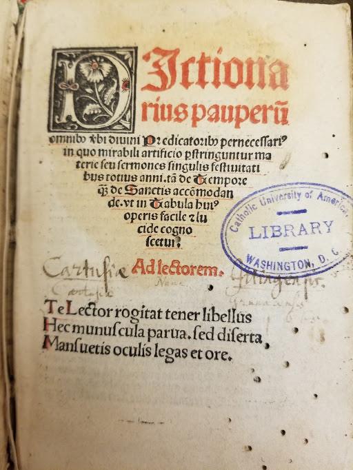
The next major changes deal with the expansion of intellectual information on the title page. Today when we think of a title page, we often think of it containing the name of the work, the author, and the publisher. Possibly some additional publication information, such as the location of its printing or the date of its publication. In the late fifteenth century, label-titles began to focus more on the printer, publisher, and bookseller. In other words, details related to the commercial side of printing and not the authorial or artistic side. These printer or publisher names and locations could help serve as both publicity and brand markers for a printed work. The publisher may have also added details such as claims about the value of the book or a listing of its textual contents. Meanwhile, dates of publication were a much later addition, as early incunabula continued to often place that information (and the details of the author) at the end of the work on either end-titles or colophons. (End-titles being here label titles that are placed on a separate page at the end of the text.)
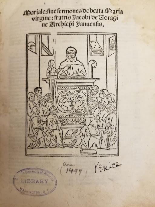
The next developments for title pages comes in the form of imagery, particularly in the forms of wood cuts (and bordered pages by the sixteenth century). Title pages fully designed by woodcut are themselves fairly uncommon, as they were costly to produce and limited the style of lettering in the title or other text on the page. As a result many, many of the early title pages with any woodcut features are products of a mixed method of typeset for the text and a woodcut image.
Many of these early woodcut images were standardized to reflect general themes of the text, the intended usage for the work, or indicate the printer. For example, two typical title page images were one of students reading at a lectern or a pastor delivering a sermon. This was not only an economic way to utilize the same woodcut across multiple works, but it served as a marketing tool for highlighting the intended usage of the work.
This is not to say that there were no later developments nor that other forms of introducing a book’s text did not continue to exist alongside the title page. However, the title page was fairly standardized by the middle of the sixteenth century, with much of the changes in the next few centuries primarily dealing with modifications to the way the text or images on the title page were presented or laid out. By the mid-sixteenth century, the bordered title page was commonplace with an established printing of title, author, publisher, date, etc.
However, to speak briefly on the later developments, we can point to the addition of frontispieces as stylistic drawings that faced the title page. Usually these had no text, but provided a vivid illustration of the text’s contents. Also, beginning in the seventeenth century, the title page began to shift from short titles to long titles with certain words emphasized via distinctive type or ink.
By the time the eighteenth-century begins, title pages begin to shorten their titles, with brief text and less ornamentation. However, the nineteenth-century witnessed both trends, with a return of verbose titles and highly ornamented borders and a continuation of less ornate title pages. Finally, when we turn to the past century, title pages seem to have become more subdued in the post-war printing boom. In the digital age, we even continue to place title pages at the start of our ebooks. It is a curious trait to see on a book that does not require physical protection of its text pages, but may perhaps represent a commercial and cultural legacy that has evolved alongside the production needs and choices that ultimately led to the creation of the title page.
For more information:
Very interesting article, thank you.